About the design
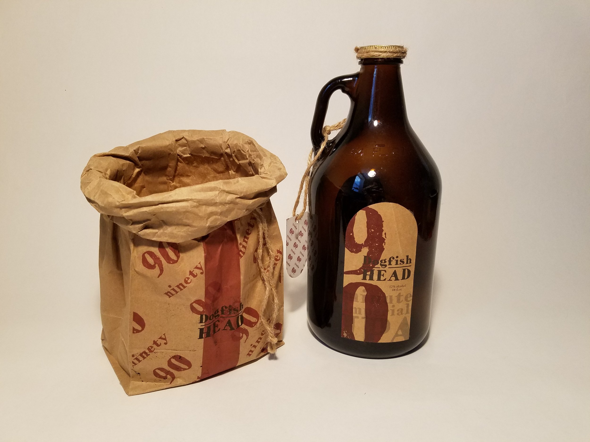
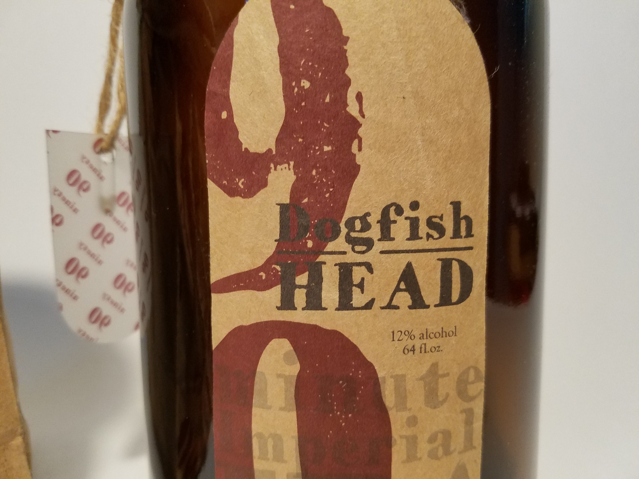
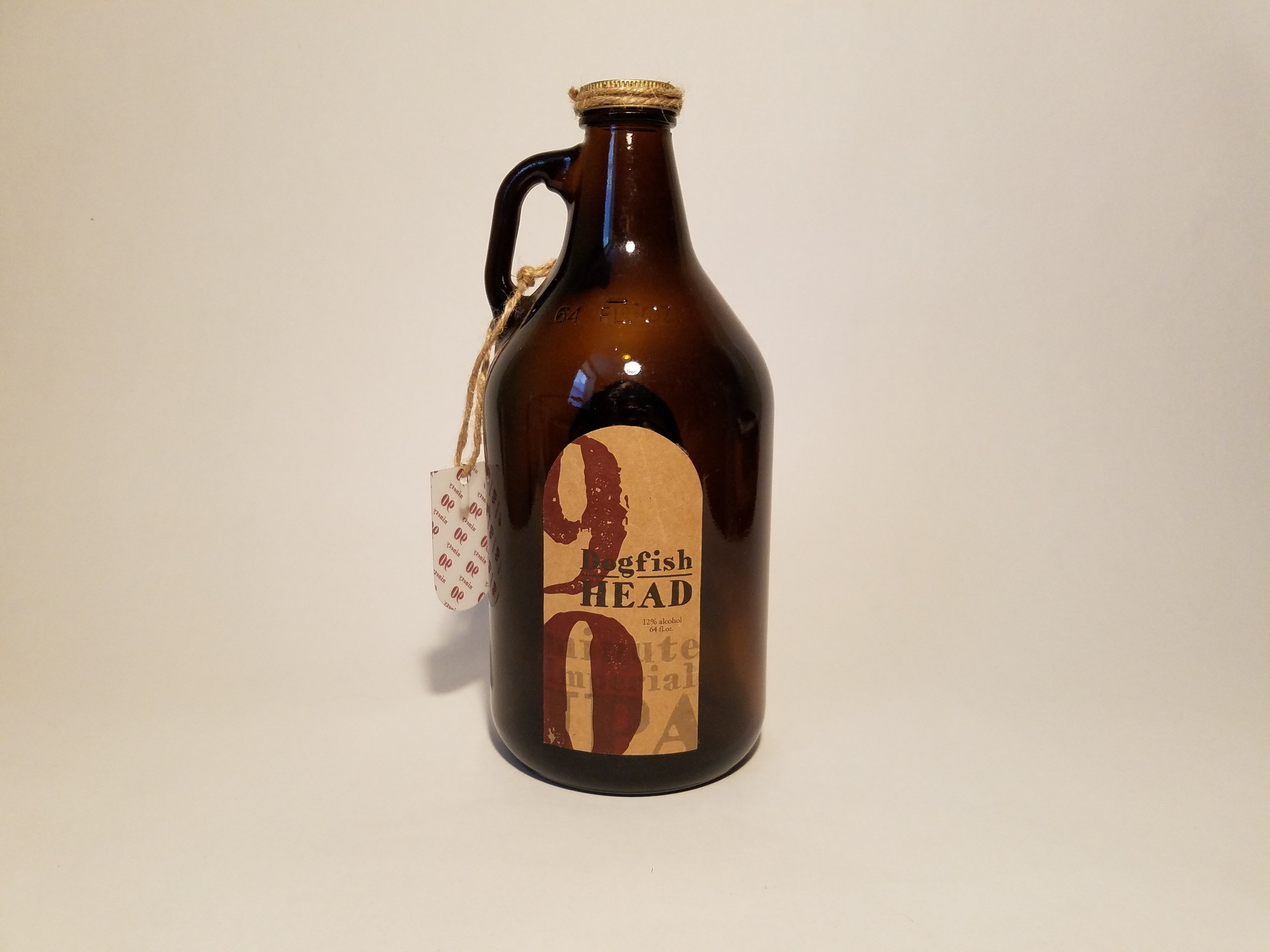
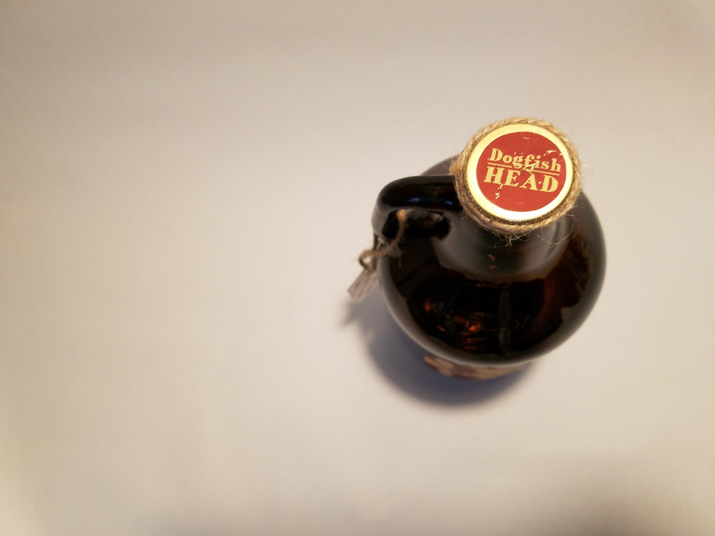
This particular repackaging focused on the typography and how that interacts on the bottle shape and label rather than any drawings. The original idea was to have this corrugated cardboard as the label, but turned out to be rather hard to manipulate around a round edge. Another alternative was using the texture of brown paper bag to still give this label a worn and rustic look but to relate it back to liquor being carried in brown paper bags.


